Oftentimes, time flies for small business owners – one moment you have a business idea, then before you know it, your business has been running for 5+ years. (Time sure does fly when you’re having fun.) That being said, it is also common for brands to come together quickly, which means your color scheme may not be fulfilling its purpose. Now, some believe that colors are just there to make an image look nice, but there is psychology and thought behind colors chosen in brands because each color can represent different meanings.
As a local digital marketing agency, the Succeeding Small team is no stranger to branding. We understand all the important pieces that make your brand and business cohesive. One key piece of branding is color psychology, which is what we’re going to dive into today.
What is Color Psychology?
Color Psychology is the study of how colors affect perception and behaviors. When it comes to marketing and branding, color psychology is how colors impact the consumers’ impressions of a brand and has the power to influence consumer behavior when purchasing one brand over another. Now, color psychology is not black and white; all humans vary in factors such as culture, gender, and age. This means the colors can mean different things to each individual. But for the most part, colors have words that are associated with certain feelings and those can be positive or negative. You have to decide how you want to represent yourself to your customers and what makes the most sense to you. Logos are the same way. Logo derives from the Greek word “logos” which means “word.” Logo is creating a visual identity for a “word” that speaks about a particular business. So when deciding on any part of your brand, you have to decide what words you want associated with it.
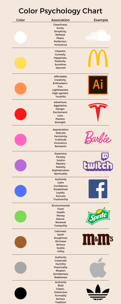
Understanding color psychology is important when beginning the branding process because it helps to portray your brand the way you want it to be perceived. A poor color selection can do damage to a brand and how your customers perceive it. Our list focuses on the main colors: red, orange, yellow, pink, green, blue, purple, brown, grey, black and white. Listed below are the general principles and associations connected with the main colors:
Red
Red can create strong emotional connections from blood and warfare to love and passion. Companies can use red in logos to hold viewer’s attention and it is also known to raise blood pressure or make people hungry.
- Color Association: Action, adventure, aggressive, anger, danger, energy, excitement, fearlessness, love, pain, passion, power, strength, vigor, warning
Orange
Orange combines red and yellow attributes. It’s used in logos for many reasons: to create playfulness, draw attention, stimulate emotions, or even appetites.
- Color Association: affordable, confidence, courage, creativity, enthusiasm, friendliness, frustration, fun, high-spirited, ignorance, innovation, lighthearted, sluggishness, warmth, youthful
Yellow
Yellow is a bright and highly visible color. It is used in logos to get attention and create a sense of happiness and warmth.
- Color Association: anxiety, caution, cheerful, cowardice, creativity, curiosity, fear, frustration, happiness, positivity, sunshine, warmth
Pink
Pink is known as a feminine Color which means it conjures feelings of innocence and delicateness. It’s used in logos to add a feminine flare and to target a female audience.
- Color Association: appreciation, delicate, femininity, floral, gentle, gratitude, innocence, romantic
Green
Green represents life and renewal. It’s no surprise that it’s use in logo design would be centered about nature and often found in eco friendly company logos
- Color Association: blandness, boredom, environmental, envy, fresh, growth, harmony, health, healing, hope, money, nature, renewal, sickness, tranquility
Blue
Blue is known as a calming color that can stir up images of authority, success and security. It expresses positive emotions. It is probably the most popular color to be used in logo design and branding.
- Color Association: authority, calm, coldness, confidence, dependability emotionless, established, logic, loyalty, success, secure, trustworthy, unfriendliness, uncaring, unappetizing
Purple
Purple implies royalty, mystery, spirituality, and sophistication. It is often found in brands relating to education and luxury products.
- Color Association: expensive, extravagance, fantasy, imaginative, inferiority, justice, luxury, moodiness, mystery, nobility, regal, royalty, sophistication, spirituality, wealth, wisdom
Brown
Brown indicates nature, woodiness, and utility. This color is related to construction and legal due to simplicity, warmth and neutrality.
- Color Association: calmness, depth, dirtiness earth, heaviness, natural, reliability, roughness, richness, simplicity, serious, subtle, support, utility, unsophisticated, warmth, woodsy
Black
Black is a powerful color that can either represent power, sophistication or evoke emotions of sadness and anger. It is used in logos to create a sense of boldness, simplicity and sophistication. A Second-to-none status for your brand.
- Color Association: authority, bold, classic, conservative, coldness, distinctive, elegance, evil, formality, heaviness, menace, mourning, mystery, power, security, secrecy, serious, sophistication tradition
Grey
Grey is a great color for a neutral and cool look. It works well with most other colors and is used to create a balanced look.
- Color Association: authority, balance, blandness, corporate, dampness, depression, hibernation humility, intelligence, neutrality, practicality, reliability, respect, somberness, stableness, timelessness
White
White is known as the universal color of peace and purity. Most of the time, when white is used in a logo, it is a revered text or negative space.
- Color Association: clarity, cleanliness, coldness, emptiness freshness, innocence, isolation, peace, perfection, purity, refined, simplicity, sophistication, sterility

Incorporate Color Psychology into Your Brand
At Succeeding Small, we want to help you represent your products and services with a brand that speaks to you and your customers. Our team will work hard to make sure your brand matches what your mission is. If you have questions on color schemes or how to get started, contact Succeeding Small to work with experts and baking your brand.
Know your audience.
Download our Buyer Persona Guide to target the right customers with the right message.


